Thursday, April 28, 2016

Friday, April 29 composition in photography

In class today: quiz on Tuesday's reading.

Composition: Triangles

Josef Koudelka, Gypsies, “Skeleton boys”


Click to read more

Triangles are one of the best compositional techniques you can use in photography to fill your frame, add balance, and add movement in your images.
Josef Koudelka / CZECHOSLOVAKIA. Slovakia. Zehra. 1967. Gypsies. �

The three kids fit in perfect harmony and fill the frame of the shot quite well. Can you find the repeated triangles?

Josef Koudelka, Gypsies, Reclining man

In this shot, you see a man casually lying in his bed, proudly displaying a picture frame and a large metal coin.
koudelka3

What is being repeated?

Josef Koudelka, Gypsies, 3 guys

koudelka2

How is the image framed?
What is the mood of the image?
What is repeated?

Alex Webb, Istanbul, Telephone booth

alex webb1

What are the three different layers?
What unifies the image?

Alex Webb, Istanbul, Kids playing with ball

alex webb2

How is this image appear surreal? 
How would the image appear if the ball were left out?

Alex Webb, Cuba, Woman and 3 dogs

alex webb3

How does woman's checkered shirt impact the image?
How do the dogs create a sense of tension? (look closely!)

Eric Kim, Mumbai

Mumbai, 2013

Composition: Diagonals

Click to read more

There are 3 types of main lines: the horizontal, vertical, and diagonal line. They also go in degrees of intensity (the horizontal line being the least dynamic and the diagonal line as the most dynamic).

1. The horizontal line

The horizontal line is by nature, flat. If you think about anything in nature that is horizontal — it is at rest and unshakeable. Imagine a man lying on the ground or a tree trunk lying flat on the ground. It is solid — and isn’t going anywhere.

2. The vertical line

The vertical line. Far less secure than the horizontal line, and thus more dynamic. Imagine a tree about to topple over, or a man standing straight up.


The vertical line. Far less secure than the horizontal line, and thus more dynamic. Imagine a tree about to topple over, or a man standing straight up.

The vertical line is much more dynamic than the horizontal line. The horizontal line is going straight up and down– which makes it much more “off-balance.” Imagine anything in nature that is vertical. Trees are tall and powerful, but if they didn’t have strong roots they would be easy to tip over. Skyscrapers which go for hundreds of floors upwards are very unstable, and a earthquake could easily topple them over (versus a flatter structure which is more stable and close to the ground).
Imagine a man standing tall. Would it be easier to tip him over to make him fall? Yes. How about a man lying down (horizontal line). No- the man lying on the ground is stable.

3. The diagonal line


The diagonal line. The most dynamic out of all three lines. Imagine like the line just got pushed over, and is about to fall down.
It is the most dynamic of all the three lines. After all, in nature anything that is diagonal is far more unstable than both horizontal things and vertical things. A diagonal line is something literally about to tip over.
Imagine a man standing up, and you shoved him quite hard. He would then start tipping over, making a diagonal line with his body. He is about to topple over– full of dynamic energy and tension.

Henri Cartier-Bresson. ROMANIA. 1975. In a train.

Figure 2: Drawing the reciprocal line through the former line. Now you can see, the intersecting points brings focus on the woman's face.

Note the reciprocal diagonal lines.
Where does the photographer want you to focus?
How about triangles?


hcb-diagonal-3

Form follows content?
OR
Content follows form?

Henri Cartier-Bresson. FRANCE. 1932. Marseille.

Henri Cartier-Bresson. FRANCE. 1932. Marseille.

Where are the diagonals in this image?

Henri Cartier-Bresson. SPAIN. 1933. Valencia Province. Alicante.

Henri Cartier-Bresson. SPAIN. 1933. Valencia Province. Alicante.

This shot to start off is quite enigmatic. You see three characters in the shot, with the person in the middle being the most prominent. But is the person a man or a woman? The person has masculine features in the face, but looks quite dainty and has perfectly sculpted eyebrows and some eyeliner around the eyes. This is the first big puzzle. Then you have the other two characters in the frame looking a little uneasily at the photographer (HCB) while performing some sort of play with their hands.
The person is transgender, which solves part 1 of the mystery. Part 2, what caused this strange arrangement to come to be? Apparently HCB said all of his photos were unstaged– which actually isn’t true. Anyways, try to draw the diagonal line in the shot. And no- it isn’t perfectly corner-to-corner this time. Still can’t see it? Focus on all the hands that are connecting in the shot. 
Figure 1: Diagonal connecting the hands together.
Now find the triangles.
Figure 2: Some triangles I see in the shot.

Henri Cartier-Bresson. FRANCE. 1959. Paris. The Palais Royal Gardens.

Diagonals can also add a strong sense of movement and direction. We will see this well in a shot he took at the Royal Gardens in Paris:
Henri Cartier-Bresson. FRANCE. 1959. Paris. The Palais Royal Gardens.

You can easily pick out the diagonals? What serves as a contrast to their motion?

Henri Cartier-Bresson. USA. 1947. Cape Cod, Mass, Independence Day.

Henri Cartier-Bresson. USA. 1947. Cape Cod, Mass, Independence Day.
Point out the diagonals.
 What emotions might be embedded in the woman's hand gesture?


Figure 2: See all of the other diagonal lines in the background.


Cornell Capa. USSR. 1958. Moscow. The Bolshoi Ballet School.

Cornell Capa. USSR. 1958. Moscow. The Bolshoi Ballet School. �
Approximately, where do all the diagonal lines intersect?

Composition: Framing

Framing itself is a pretty basic compositional technique and used by photographers to retain focus, energy, and depth in their images.

According to Google, a frame is: A rigid structure that surrounds or encloses something such as a door or window.
In photography, every image we capture is a frame. We decide what to include in the frame and what not to include in the frame. We are selective in terms of what gets include and what doesn’t get included.
For example, whenever taking a photograph of a subject, we have several choices to tell different stories or narratives.
Take a look at the following:
Netherlands, 2012
This looks like a man by himself.
Now look at the contact sheet. 
Contact sheet of all the photos I took of this man.
How has the narrative changed?


Framing in composition

When it comes to framing a scene, you can also add a compositional technique of adding a frame inside your frame. Having a frame inside your frame adds more focus to your scene– and tells your viewer what to focus on

In this photo, a man is surfing in the river.
 webb0
How does the bulls eye frame change the focus?


Figure 1: Note the frame of his "bulls-eye"
The frame (of the bulls-eye) gives focus to the photograph. It forces the viewer to look at the surfer in the frame (instead of the biker on the left). And it also gives the uneasy feeling that the surfer is being watched by a sniper — about to shoot him.

Note the similar technique employed here:
Manila, 2013


Charlie Kirk
How do the geometric shapes contribute to the mood of the photo?

Composition: Perspective

Google defines “perspective” as the following:
"The art of drawing solid objects on a two-dimensional surface so as to give the right impression of their height, width, depth, and position in relation to each other when viewed from a particular point."
 Unique perspectives or vantage points make images have different impressions and feelings.
To make more edgy and interesting photos, try embracing more unique perspectives (shooting from a really low angle, or getting on top of a roof and shooting from a high vantage point).

Low Perspectives

Hollywood Height Chart. Click for full-resolution

They call it the “superman effect” in which they are photographed from low angles. When you take photos (or video) from people when you are crouching down and looking up– people look much bigger, taller, and powerful than they really are. Actors also often stand on stools or boxes when filming– to further add to this “superman effect.”
USA. New York City. 1989. Feast of San Gennero, Little Italy.

extremely low angle

Note how close Gilden got to fill the frame. There is no really empty space under-utilized in the frame — except the negative space of the sky which is necessary to make a stronger contrast against the older woman’s head.
All of these elements make for a well-balanced photograph, with lots of strong geometry in the photo (triangles, circles, and squares).
Bruce Gilden / Magnum Photos. USA. New York City. 1995.

Downtown LA, 2011


Note how the low angle accentuates the triangle of the handlebars.
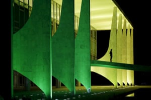
Figure 1: Note the triangle that his handlebars make in the frame.


Charlie Kirk. From his "Japanese (people are strange)" series

High Perspectives
Rene Burri / Magnum Photos. BRAZIL. Sao Paulo. 1960.

The high vantage point gives one that wonderful sense of scale. The cars on the bottom are tiny– but visually they don’t feel that far away. And the men in the far right of the frame– also are small silhouettes– but look like giants compared to the tiny cars below.
rinzi2


Thursday, April 28 project details


Remember that you have a quiz tomorrow on Tuesday's class reading.
I have not received the Eastman House assignment from some folks.  Please send along.

Personal photo project details.

Personal Photo Project is due Wednesday, May 11. This will give you two weekends.  Be mindful that we will be working on supporting material next week. You will have Monday, May 9 and Tuesday, May 10 to work on the organization and writing component of the project.

Of what will this consist?
    You may take as many pictures as you wish, but you will share only 10 images with the class.
Can I have more?
   No.

How will these be shared?
    You may have them on a Prezi or a Power Point or some other similar program. Put your power point on a thumb drive, please, rather than sending through e-mail.

So what are the parameters for taking these pictures?

      You must have an objective, a theme, a controlling idea; that is a clearly defined point to taking your series of photos.This may range from something expressive or emotional to an event or occasion. This is not to be a haphazard collection or arrangement of images, but a thoughtfully planned out goal that unites an idea and demonstrates your proficiency in using various photo techniques to convey your ideas.  
 Can it be from some place I already took pictures?
      No, these are new images that demonstrate you have an understanding of the rules of composition, as used them to express your photo objective.
 What type of pictures must these be exactly?
  You may organize these how you wish, but within the pictures you must demonstrate your understanding the following:
        close-up
        mid range shot
        establishing shot
        symmetry
        use of foreground
        conscious incorporation of texture
        rule of thirds
       understanding of the placement of the horizon line 
       conscious incorporation of details / texture
       varied perspective (tilting up or down)
       framing
       lighting


Obviously, more than one of these will be included in a shot; however, each must be addressed at some point.

Paper Part

Not everyone can present on Wednesday, May 11,  but everyone must turn in the following graphic organizer. Be mindful that there is writing component  of the organizer. (class handout or adapt from below) Don't forget the reflection piece at the end.  Note that you will have class time on Monday and Tuesday, May 9 and 10 to assemble the writing component and Prezi / Power Points. Make sure to have your photos with you. There will be no class time on the 11th; I'll just collect your paperwork. If you wish you may put a copy of your photo onto the graphic organizer. 


Photojournalism Project                    Name_________________________________________________
Photo project objective statement:
____________________________________________________________________________________________________________________________


1


setting/ time
brief description of image
type of shot/ technical
goals demonstrated
2


3


4


5


6


7


8


9


10


                                                In approximately 250 words, describe your process of taking the photos, including any pleasures, frustrations and obstacles you encountered. 


Ten tips for taking better photos

1. Hold It Steady
A problem with many photographs is that they're blurry. Avoid 'camera shake' by holding the camera steady. Use both hands, resting your elbows on your chest, or use a wall for support. Relax: don't tense up. You're a marksman/woman holding a gun and it must be steady to shoot.

2. Put the Sun Behind You
A photograph is all about light so always think of how the light is striking your subject. The best bet is to move around so that the sun is behind you and to one side. This front lighting brings out color and shades, and the slight angle (side lighting) produces some shadow to indicate texture and form.

3. Get Closer
   The best shots are simple so move closer and remove any clutter from the picture. If you look at most 'people' shots they don't show the whole body so you don't need to either. Move close, fill the frame with just the face, or even overflow it. Give your shot some impact. Use a zoom to crop the image tighter.

4. Choose a Format
Which way you hold the camera affects what is emphasized in your shot. For tall things (Redwoods, Half Dome) a vertical format emphasize height. Use a horizontal format to show the dramatic sweep of the mountains.

5. Include People
Photographs solely of landscape and rocks are enjoyable to take but often dull to look at. Include some of your friends, companions, family, or even people passing by, to add human interest. If there's no one around, include yourself with the self-timer.

Have you ever got your photos back only to discover that something that looked awe-inspiring at the time looks dull on paper? This is because your eye needs some reference point to judge scale. Add a person, car, or something of known size to indicate the magnitude of the scenery.

6. Consider Variety
  You may take the greatest shots but if they're all the same type or style, they may be dull to look at. Spice up your collection by adding variety. Include landscapes and people shots, close ups and wide angles, good weather and bad weather. Take personal shots that remember the 'being there' - friends that you meet, your hotel/campsite, transportation, street or hiking signposts.

7. Add Depth
Depth is an important quality of good photographs. We want the viewer to think that they're not looking at a flat picture, but through a window, into a three-dimensional world. Add pointers to assist the eye. If your subject is a distant mountain, add a person or a tree in the foreground. A wide angle lens can exaggerate this perspective.


8. Use Proportion
The beauty of an image is often in its proportions. A popular technique with artists is called the Rule of Thirds. Imagine the frame divided into thirds, both horizontally and vertically, like a Tic-Tac-Toe board. Now place your subject on one of the lines or intersections. Always centering your subject can get dull. Use the Rule of Thirds to add variety and interest.

9. Search for Details
It's always tempting to use a wide angle lens and 'get everything in'. However, this can be too much and you may loose the impact. Instead, zoom in with a longer lens and find some representative detail. A shot of an entire sequoia tree just looks like a tree. But a shot of just the tree's wide base, with a person for scale, is more powerful.

10. Position the Horizon

Where you place the horizon in your shot affects what is emphasized. To show the land, use a high horizon. To show the sky, use a low horizon. Be creative.

Three types of photos dominate photojournalism 

1.establishing shots2. mid-range shots and 3. close-ups.

Let's practice identifying them. What other terms might you use to describe them?

1.


2. 


3. 

4. 


5. 

6. 

7.

8. 

9.

10. 

11.

12. 

13. 

14. 

15. 

16. 

17. 

18. 

19. 


20. Aleppo, Syria: Civil defence volunteers

21.Brasilia, Brazil: Planalto Palace

22.Guatemala City, Guatemala: The body of a rubbish collector who was killed in a landslide

23. Grisons, Switzerland: Anti-frost candles burn in a vineyard

24. Whitley Bay, England: The sun rises over St Mary’s Lighthouse